Q4 inc App 🇨🇦
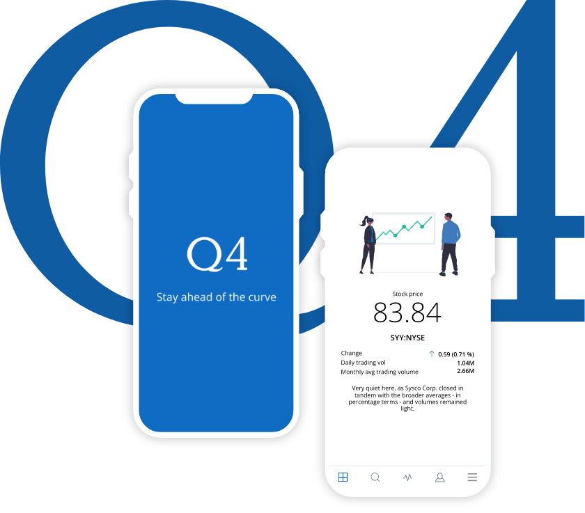
The Q4 app had not been supported for a long time, so there were a lot of issues, bugs, and improvements to be made, but supporting the app was much more expensive than starting a new one. I was temporarily hired to do the discovery on this project.
Role:
Product Design
Timeframe:
Nov 2021 – Jan 2022
Platforms:
iOS, Android
01. AVAILABLE DATA
Looking inside the company
Old researches
First, I got all the data from previous research to understand what the company already had of information that could help us. I got information from an old research that was done for the app but that was not carried forward.
I worked on this old research data and separated it into topics that could help us.
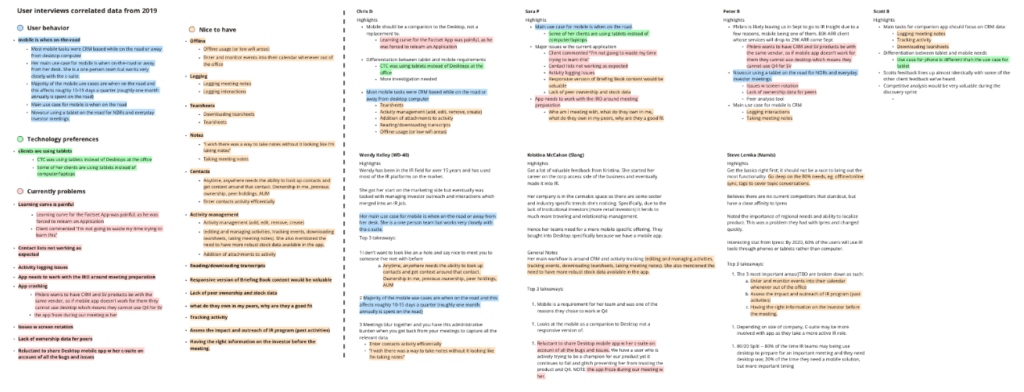
Nice to have
User behavior
Technology preferences
Problems faced
Quantitative data
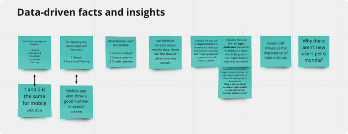
I also got metric data from the app and the desktop platform and worked on them to try to find out some things like the most used features, most accessed pages, and other information that could bring answers and assumptions.
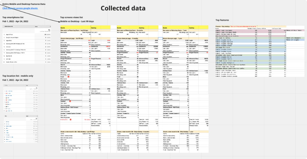
I was able to discover the most used features on the desktop that I didn’t have in the app, behavioral differences between the app and desktop, and login issues that users were experiencing with the app.
02. CURRENTLY PRODUCT
Understanding what we have
Mobile vs Desktop
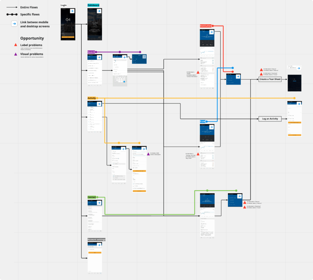
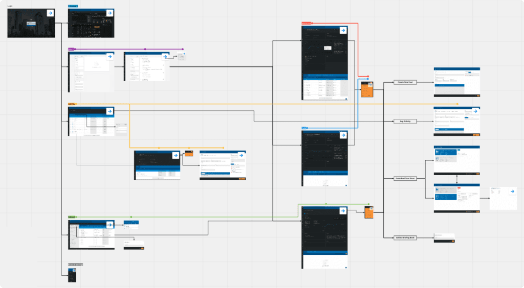
I also compared the desktop version with the app to understand how different they were and what they delivered to users.
I designed the navigation flows both in the current app and in the desktop platform, then I created a link between each screen of the app with its desktop version to make the comparison better.
App
Desktop
Differences between platforms
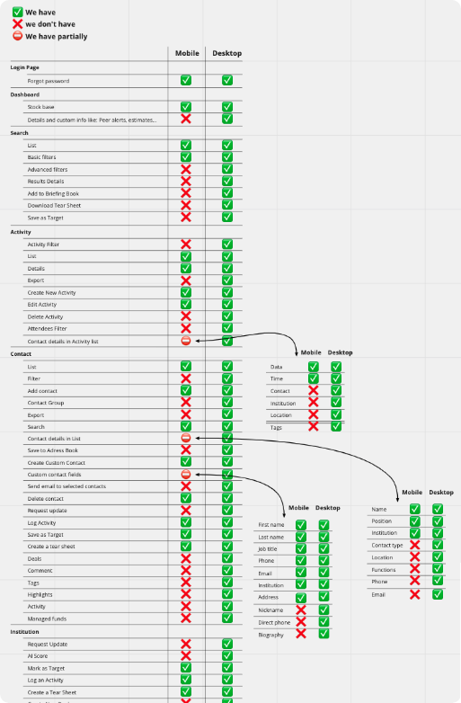
With that, I identified more problems within the app, such as features that didn’t work and inconsistencies between versions.
I also made a comparison between the app and desktop versions.
03. IMPROVEMENTS
Add value to the user
Quick wins
At the end of that, I separated a list of quick wins that we could attack in the new app to make the first version come with some improvements based on problems found in previous research.

04. User opinion
Talking to customers
After that, I started interviewing the users to get more feedback, and then I broke it down into a few steps.
Document the survey structure with users
Define the sample of users and salespeople
Define the script for interviews with users and salespeople
Pilot test of the script
Hightlights
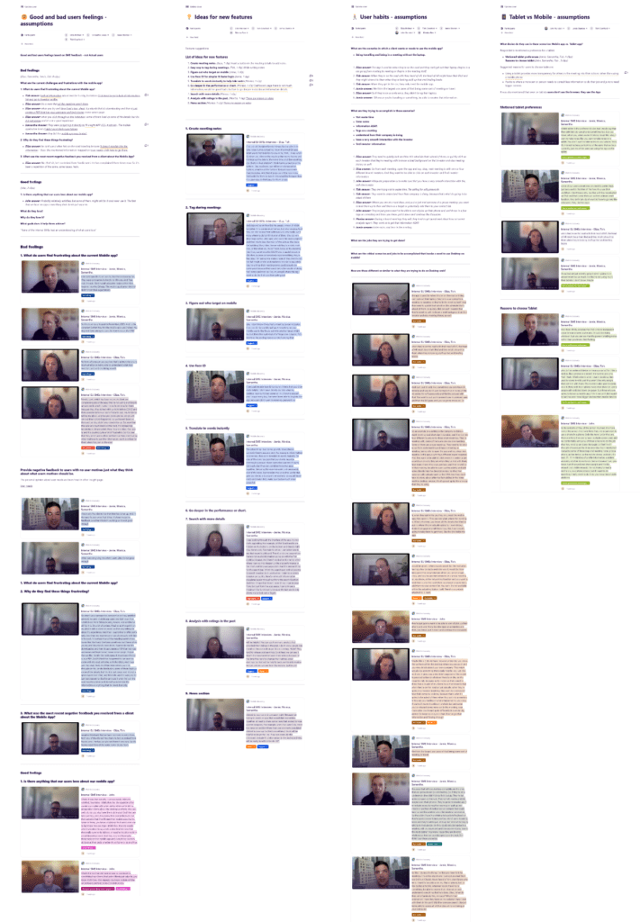
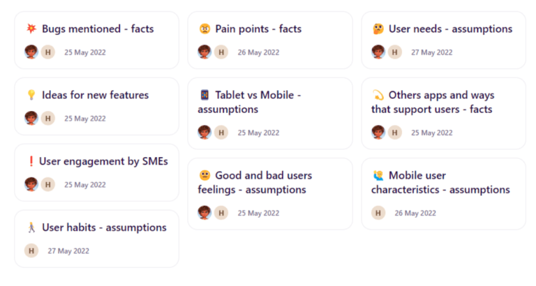
The result of the interviews I managed to separate into 9 topics that helped us to understand the needs of users, such as habits, preferences, pain points, ideas, and many others.
Insights
With these highlights, I got several insights into decisions we could make to develop a better product. Each of them with high depth details so that decisions were based on clear information.

Interview results
With the result of all this research, I moved on to the design of the app. We considered everything we learned, focusing on the basic navigation and then improving it.
05. DELIVERY
The user interface
That’s when the interface design part started, where I was revamping the screens according to the research findings and the Q4 design system.
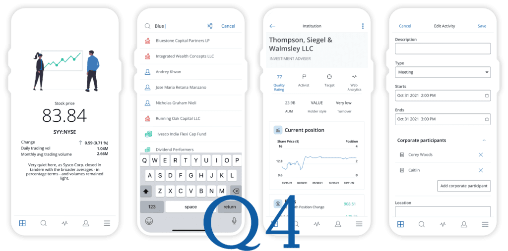
Unfortunately, I didn’t finish designing the interface because the contract was for a certain period of time, in which Q4inc planned for me to work on the Discovery stage. In conclusion, I delivered all the discovery work and a part of the ideation.
