UOL Mail Apps 🇧🇷
explore prototypes
Android
iOS
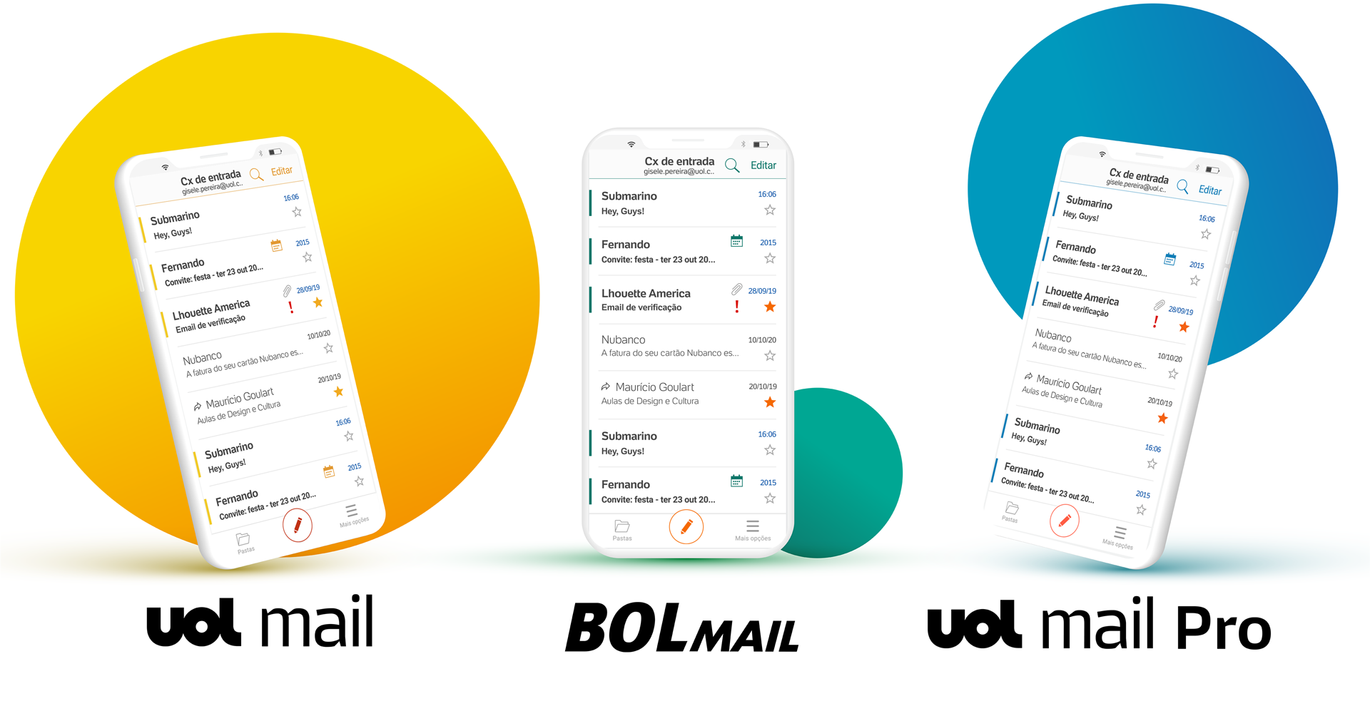
The UOL Email Apps were built for 10 million users who only had access to email via the web. These Apps are UOL Mail, UOL Mail Pro, and BOL Mail, but they use the same structure.
Role:
Product Design, Research.
Timeframe:
2018 – current
Platforms:
iOS, Android
01. scope
Challenges faced
The UOL Company had hired another company to develop the Email applications. Unfortunately, the contracted company did not deliver a good experience to the users. Due to many problems with the Apps delivered, the UOL company decided to discard these apps and build new apps within the company.
RESULTS ACHIVED
the Release
Before and after
Result
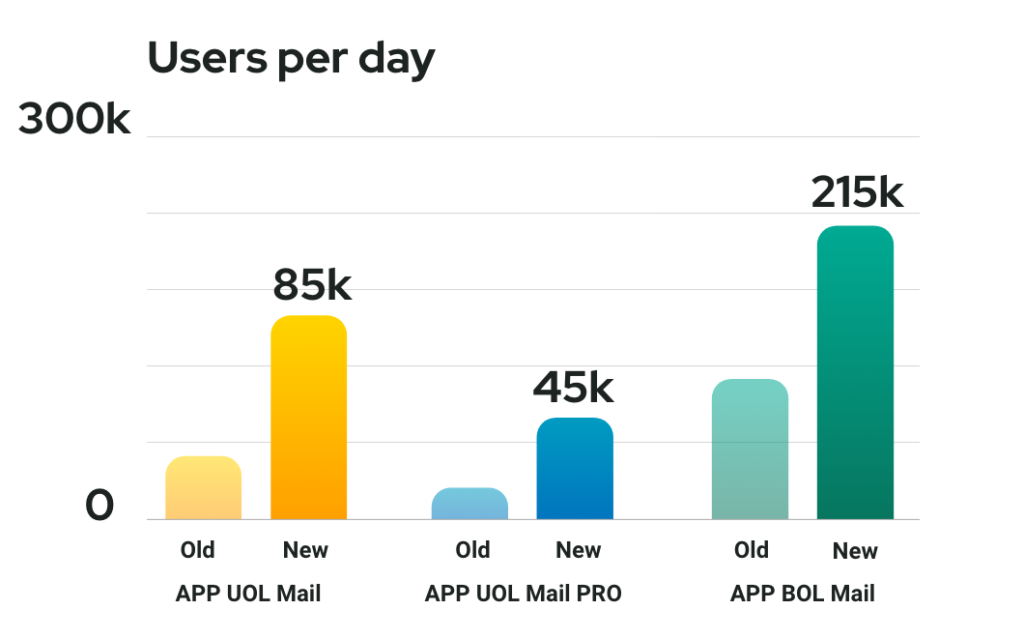
After the launch the new apps, we were able to see an increasing number of users who started using the app and also in the store reviews.
Store evaluation
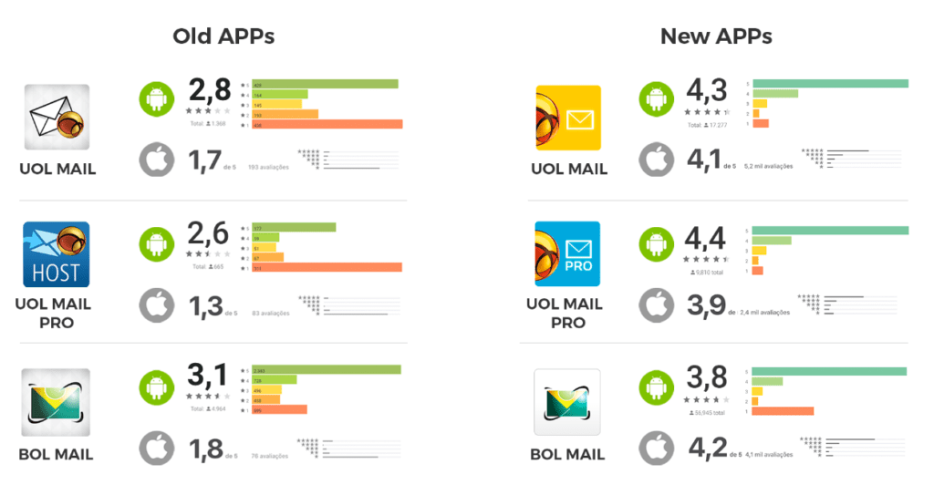
It also brought the data from the scores in the app store, App Store, and Play Store.
HOW I ACHIEVED THESE RESULTS
02. problem
Understanding the context
We started by mapping the main users’ pain points with feedback information that the old apps already had. Within the apps stores, there were several negative comments about the old apps that indicated where the users’ biggest pains were. In addition, we did some interviews. We separated some users’ profiles, also users’ data that the company already had, and others’ data we obtained from users’ surveys, such as interviews and benchmarks.
Desk research
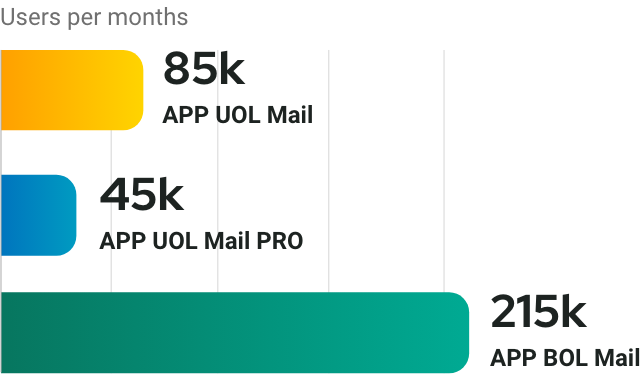
Desirability and engagement
Users per month, Desirability, and engagement: The graph on the left indicates the average number of users per month of the old applications. The number of users shows the users’ need for email APPs.
Source: Google Analytics
Reviews about previous APPs
Reviews about previous APPs: Data indicates the rating and amount of ratings. These notes informed how dissatisfied users were with the old APPs.
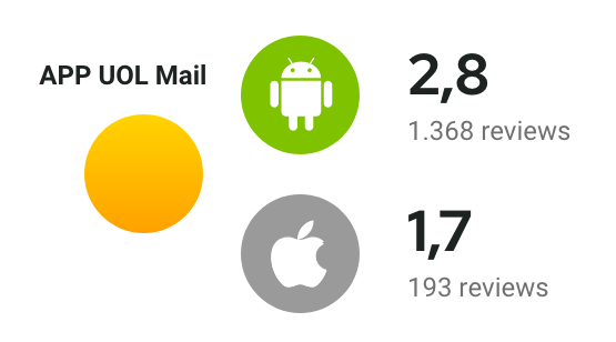
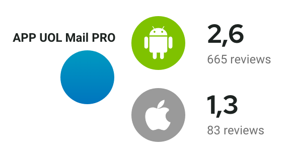
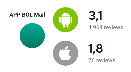
Fonte: Google Play Store and Apple App Store.
Problem Statement
Users’ pains and biggest problems were mapped from what they say in app reviews within app stores.
Very slow application. It takes time to sync and bring new emails and send emails.
Many mistakes. These errors appear at various times when using the app, making it impossible for the user to view attachments, delete emails, and view emails.
Users feel abandoned by developers. There are many quotes about a lack of update to fix existing problems.
Lack of features in the app. Users are often forced to go to a computer to complete the action they needed.
Very complicated app navigation. Several reports of difficulties with using the app were identified.
Application crashing a lot for no apparent reason, ends up closing by itself.
Users get frustrated by using a paid product while other free competitors offer better quality apps.
User journey
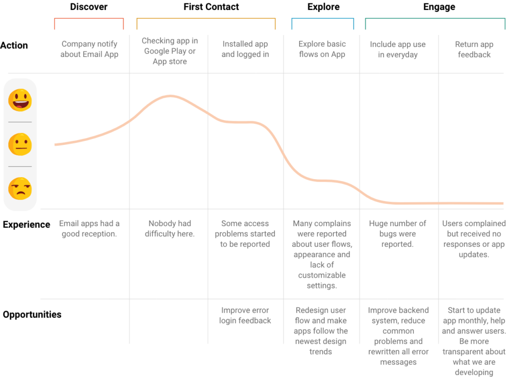
Collecting information from real users from app reviews and calls in the call center and triangulating with information from stakeholders plus information from Google Analytics, it was possible to create a user journey.
03. Ideation
Discovering what to build
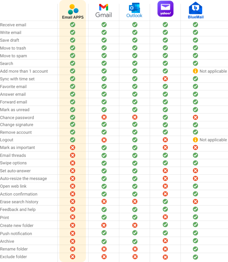
Benchmarking
Comparing our product to competitors that our users compare us to helps me understand what they believe is a good solution to the problems they face today. After this consolidation, it is always easier to define what to build.
Priority Matrix
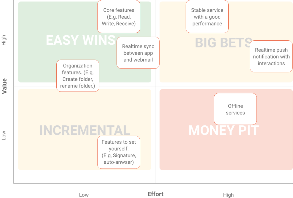
Before defining what the MVP would be, I had a dynamic with the entire team of developers and stakeholders to discuss what we could deliver with greater value and less effort to deliver something of value in the shortest possible time to the user.
04. Creation
Bringing ideas to life
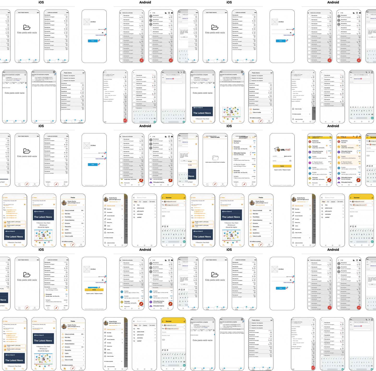
Wireframe
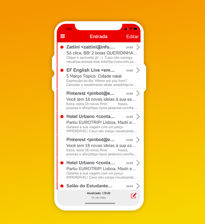
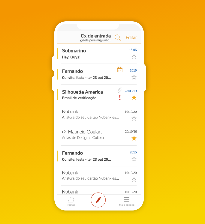
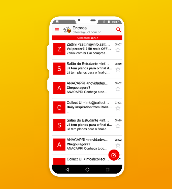
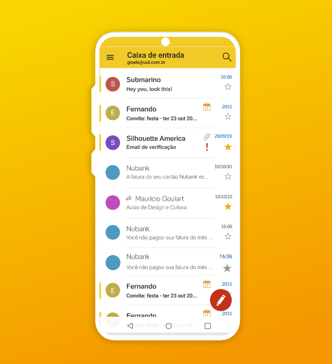
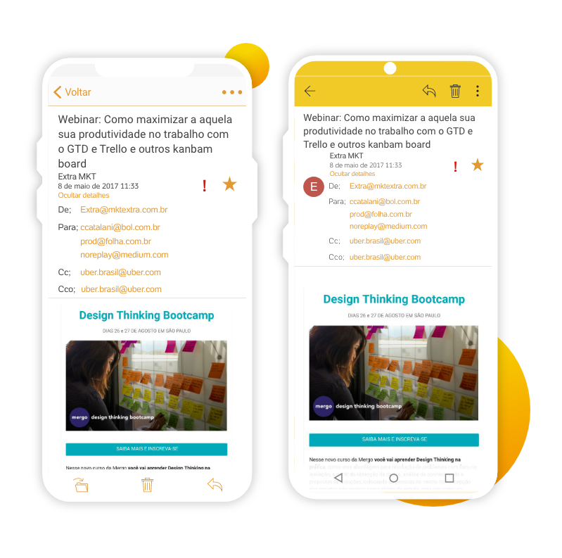
I created the digital wireframe to visualize how the functional prototype would look. With the data shown above, I found patterns that would facilitate usability for users. I also identified that it would be better for each platform to have interactions and flows more consistent with the native device, so iOS and Android apps had different navigations.
05. DELIVERY
Value to the user
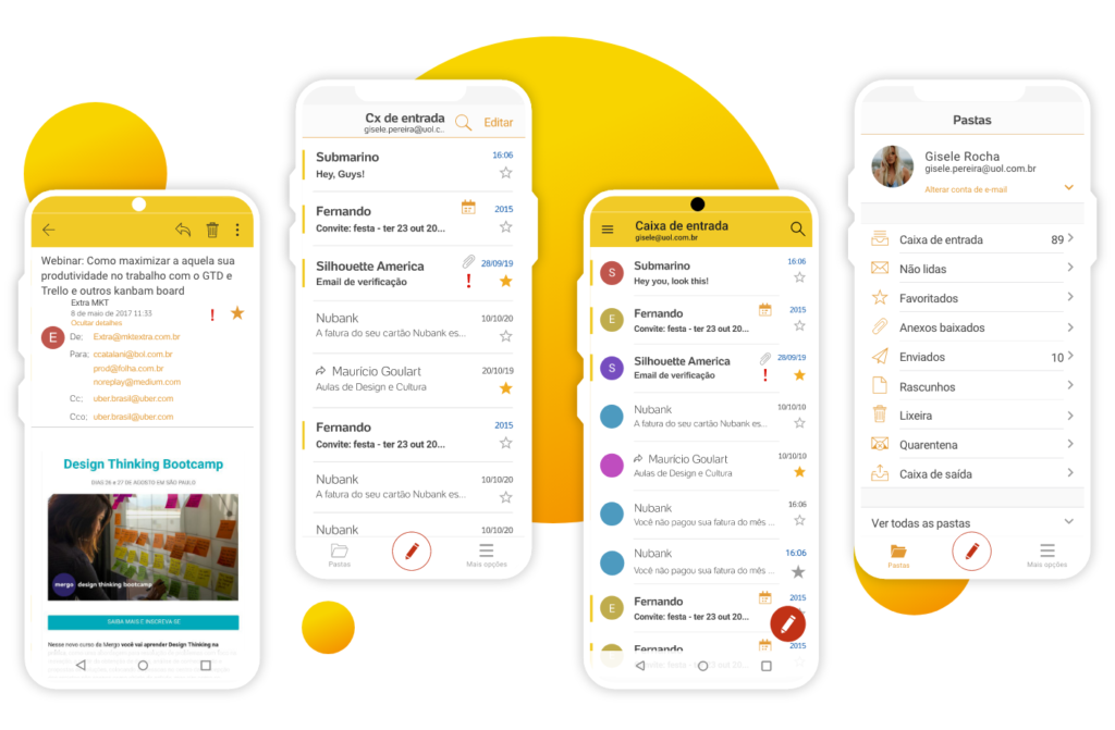
User interface
After all the research, wireframing, and alignment, the product’s user interface was built to be developed and tested with users, including all the features that should be included in the product’s MVP, and also with a list of future features.
Differences between iOS vs Android
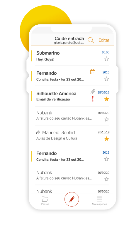
Minimalist design
I followed a minimalist style to show how the new app fits perfectly between modern apps or any other competing app, following trends, and keeping a modern design.
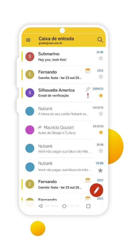
Consistency with the operating system
Each system received components according to the operating system to facilitate the user to identify and use the product.
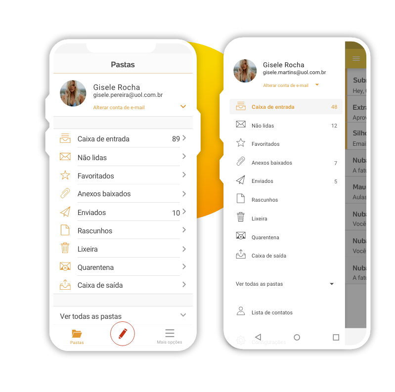
Navigation
Different navigation flows according to the user’s mental model of the specific product.
06. Validation
Testing the solution
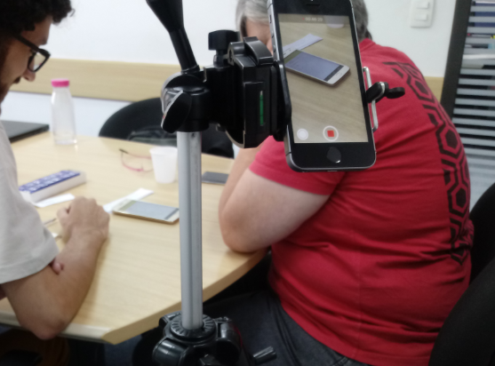
Usability test
I applied some usability tests to evaluate the UOL Apps and identify usability issues among others that we could solve before launch.


Goals
Understand the difficulties users may experience with the app and what we can fix before launch. In addition to capturing information on desirable features and understanding user habits.
Test structure
The test consisted of asking questions and asking users to perform tasks, evaluating the time taken to complete the task, difficulty, and personal opinion about the application and the tasks.
Information to consider
10 people were selected, 5 iOS users, and 5 Android users. All were already users of the application. Users were diversified by age, gender, and time as a customer based on previous research.
Test findings
To summarize the entire usability test report, I brought here the most important points discovered.
Out of 14 tasks, only 2 tasks (30% of users) had difficulty.
On a satisfaction scale comparing the current app with the new one on a scale of 0 to 10, the new app scored 8.7.
50% of users had a problem with the way some functions were written in the app.
Improvements
- Fix the flows that were having problems.
- Consider use cases that have not been addressed.
- Improve the app’s UX writer experience.
Before and after
iOS
Android
